The Different Price Tags of Access: Transit, Housing Affordability and Demographics
Introduction
Building a new transit system? Great for commuters. Even better for housing prices.
When cities build transit, nearby land and housing prices often shoot up. Is it just about location? Is it about transit access provided?
Or is there a secret third thing, like how (neighbourhood) demographics play a role in how much people are willing to pay for better transit access?
Transit is often framed as the great equalizer. It is supposed to connect people, regardless of socioeconomic status, to jobs, healthcare, and other everyday necessities.
But what if it is also quietly reinforcing inequality, through higher home prices and potential subtle shifts in who gets to live where?
Objective
In a recent study, I dug into this puzzle: do affluent neighbourhoods pay more for transit access to employment in Metro Vancouver? And what does that tell us about equity and housing affordability? (You can read the full study here, but this article gives you the highlights).
Study area
Metro Vancouver is Canada’s third-largest metropolitan area and home to about 2.6 million people.
It is one of the fastest-growing urban regions in North America, known for its mix of economic strength, cultural diversity, and high housing costs.
The region’s transportation system features buses, commuter trains, cycling infrastructure, and the showpiece: the SkyTrain rapid transit system. The transit system also shapes urban growth, influencing where people live, where businesses invest, and how communities develop around stations.
Measuring Transit Access
How easy is it to reach jobs by transit in Metro Vancouver?
To answer that, we use what is called a gravity-based accessibility measure.
We use employment data from the 2016 Canadian Census, identifying job locations across the region at the Dissemination Area (DA) level. Then, we measure how accessible these jobs are, using the centroid of each dissemination block (basically small neighbourhood units) as our starting point (Figure 1). To note, the access values have been normalized, i.e., scaled between 0 and 1, then multiplied by 100.
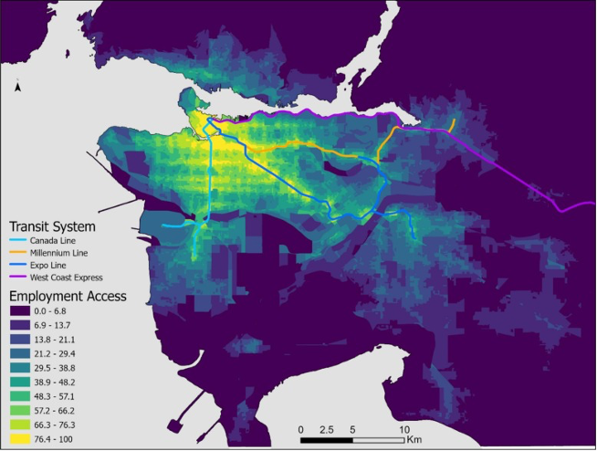
Figure 1 Transit access to jobs in Vancouver
Unsurprisingly, job access is highest in areas closer to the rapid transit network. Also, employment isn’t uniform across the region – it’s sparse in some areas and concentrated in others.
Areas like Downtown Vancouver, with the highest level of employment access, act as major transit and jobs magnets. These spots are dense, busy, well-connected, often mixing different land uses.
Knowing the Neighbourhood Types
Next, what are the different neighbourhoods profiles in Metro Vancouver?
We use a statistical clustering method called Latent Profile Analysis, which groups neighbourhoods based on similar characteristics, including income, from the 2016 Canadian Census. A neighbourhood is defined at the Census Tract (CT) level.
Following empirical testing and local knowledge expectations, the neighbourhoods in Vancouver are best grouped into four distinct profiles: Affluent, Stable Middle-class, At-risk Middle-class and Economically-disadvantaged (Figure 2).
When overlaid with the Figure 1, Affluent neighbourhoods are mostly in areas with lower transit access, while the other types, especially the Economically-disadvantaged, are closer to the city’s core, where transit access is better.
That might be because Economically-disadvantaged residents are more likely transit-reliant, and so naturally settle in places where it’s easier to get around without a car. We will come back to this, because it plays a big role in explaining why the implicit price paid for transit access varies across the different neighbourhoods.
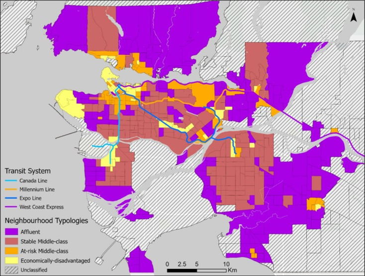
Figure 2 Neighbourhood Types
One of the biggest things that separates these neighbourhood types? Household income levels.
Affluent neighbourhoods have an average median household income of about $95k. This drops along the profiles: Stable Middle-class ($74.9k), At-risk Middle-class ($63.7k) and Economically-disadvantaged ($45.8k).
Price Tags on Access by Different Neighbourhood Types
For the fun part: figuring out whether and how much people are willing to pay for better access to jobs by transit — and how that price changes depending on the type of neighbourhood and accessibility levels.
To do this, we use residential property sales from Q1 2016 to Q3 2019, and adopt hedonic regression models.
Let me show you this cool marginal effects plot I put together on Vancouver’s condo market (Figure 3). I also ran the same analysis for freehold properties (e.g., single-family homes). You can view them in the full paper.
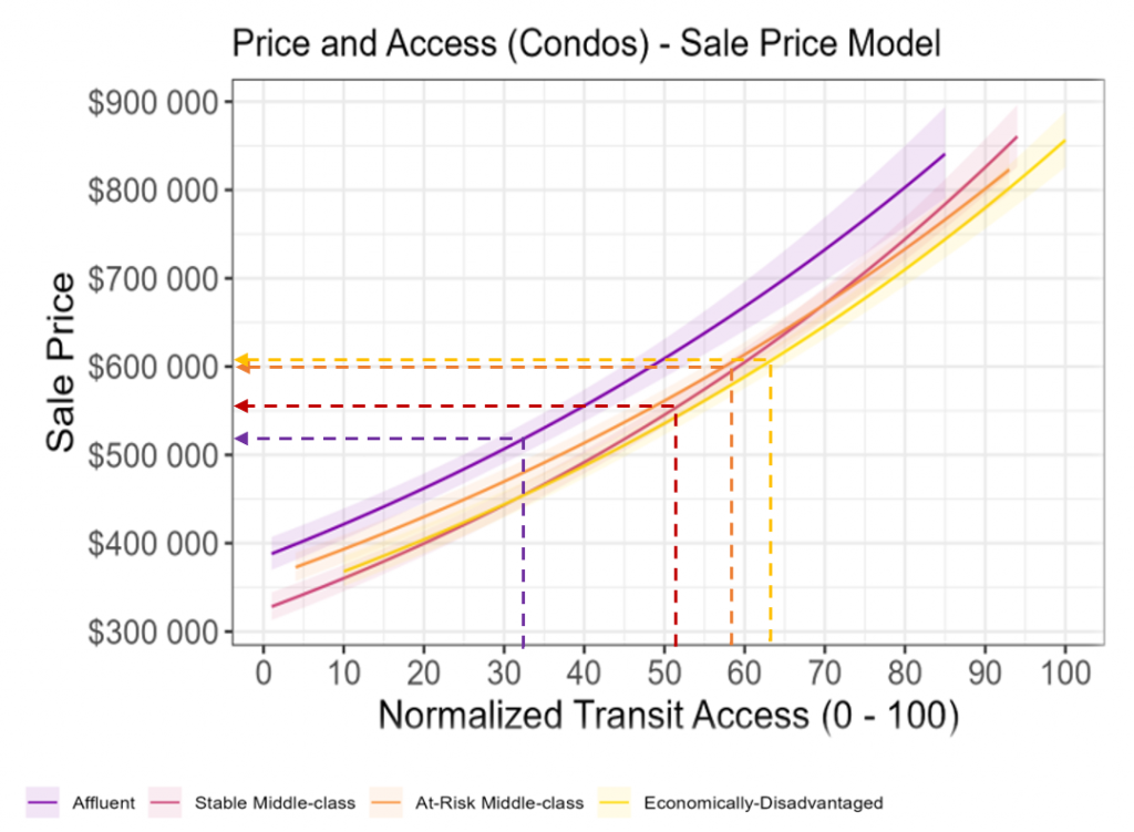
Figure 3 Marginal effects plots of price and access
Three things stand out.
First, from the curves (i.e., solid lines), as transit access improves, the price of a condo increases. Simply, transit access is indeed valued in the property market.
Second, the curves are not parallel. This means the value of transit access doesn’t look the same across neighbourhood types. Based on the steepness, we can tell how much willingness and price bids different neighbourhoods place on improved transit access.
Affluent areas (in purple) show the steepest climb, meaning they bid a higher price for better access. Conversely, Economically-disadvantaged areas (in yellow) place relatively lower bids.
This observation actually surprised me. I assumed that individuals in Economically-disadvantaged areas, who are likely to be transit-dependent, would place the highest bids on access.
After thinking it through, it started to make sense: Affluent households have more disposableincome, which makes them more able to pay a higher premium for something as valuable as good transit access.
Third and finally, remember how we saw that Affluent neighbourhoods tend to be farther out in lower transit accessible areas, while the Economically-disadvantaged ones are in areas with higher transit access?
That spatial pattern, along with some big differences in the standard errors of our curves, poses the question: What’s the actual price tag of accessibility for a typical home in each kind of neighbourhood, given different access levels (i.e., residential location choices)?
To do this, we estimate the price paid for a “typical property” (using the regression model variables) across the four neighbourhoods, given their average levels of accessibility. That’s what the dashed lines show in Figure 3.
Here’s what we find in terms of price tags (average normalized access level in parentheses):
- Affluent (32.6): ~$516,000
- Stable Middle-class (51.5): ~$551,000
- At-risk Middle-class (58.3): ~$602,000
- Economically-disadvantaged (63.0): ~$605,000
So, even though Economically-disadvantaged areas place lower bids, they’re still paying more in predicted prices, simply because they live in places with higher access levels. This demographic may bid less (compared to more affluent populations), but because there’s more of it, they end up paying more overall just to live there.
Conclusion
We talk about a “secret third thing” in the relationship between access and property prices – the role of demographics, and distinguish between those placing higher bids for improved accessibility (i.e., Affluent) and those bearing higher housing costs based on residential location choices (i.e., Economically-disadvantaged).
So, what does all this mean?
Foremost, accessibility is a valuable amenity that comes at a price.
Also, while affluent groups may really value good transit access, they may also have more mobility options (e.g., car ownership). Thus, if they want to live farther out and drive, they can.
But for disadvantaged groups, it’s a different story. Many may not have access to a car, so living in transit accessible areas is crucial. That can mean making tough trade-offs, like paying more in housing prices just to stay in accessible locations.
And here’s where the equity concerns come in. If affluent households are willing to outbid others for better access, and also decide to move into these accessible areas (which, by the way, other studies show is already happening in Vancouver), it creates a housing price pressure.
That pressure can drive housing prices up, potentially making it harder for low-income residents to stay. The result? Transit-induced gentrification, where the very communities that rely most on transit risk being priced out of the places that serve them best.
So, what can we do about it?
There is a need to protect affordability in those highly accessible areas where lower-income or Economically-disadvantaged households are likely to live.
That means thinking seriously about things like inclusionary zoning, subsidized housing, and long-term affordability strategies, so that the benefits of transit investment aren’t just available to those who can pay the most, but to those who actually need it most.
You can check out other research that I have been engaged in on the relationship between transit access and housing prices from my google scholar profile, with more studies in the pipeline.
You may also like
 Making it safe, Making it work, and Making it fun: strategies for cycling with young children in Hamilton, Canada
Getting around by bike with young children is not always easy. Children are heavy, family schedules can be busy, and children often need to be… Read More
 What can we learn from a Bike Bus program in rural Nova Scotia?
There’s a revolution happening in the rural community of Hebbville, Nova Scotia (Mi’kma’ki) and it’s accompanied by a healthy dose of bike joy. Since 2020,… Read More
 Removing Fare Barriers: Free Public Transit for Youth Experiencing Homelessness in Toronto
Noah Kelly is the Director of Research & Partnerships at the Transit Access Project (TAP) and has recently completed his Master of Arts at McGill… Read More