Mapping transit equity: finding the right amount of nuance

In this post, Willem Klumpenhower, a Postdoctoral Fellow with MJ partner Transit Analytics Lab, discusses how to map transit equity issues for decisionmakers. Using the proposed Green Line in Calgary as an example, he discusses how to make effective data visualizations that can help us advance equitable transportation systems. This a cross-post from his website.
It probably won’t surprise you to hear that I have been thinking a lot lately about decision-making under imperfect information. We have been asking ourselves and our representatives to make increasingly high-stakes and difficult choices, often very quickly.
But we are also human, and humans aren’t data-driven decision-makers. In his Nobel prize-winning work, Economist Daniel Kahnaman describes two decision making processes: A “fast” brain, which is trained on heuristics and past experience, and a “slow” brain, which takes the time to use logic, data, and reasoning to arrive at an appropriate result. This creates a tension between complexity and simplicity, between a nuanced and binary comprehension of a given issue.
At the same time we are bringing more data into our lives with each passing minute. This has given us an unprecedented ability to incorporate quantitative, objective information into the decision-making process.
But here’s the rub: the more complexity and nuance you add, the more time you need to understand the issue, think “slow”, and arrive at a reasoned decision. And yet not making a quick decision could be even worse.
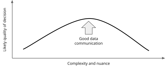
Somewhere on the complexity spectrum lies an optimal decision-making process. This is where data visualization comes in: clear, concise, and sufficiently complex visualizations provided to decision makers at the right moment can help inject just enough nuance to improve decisions without overwhelming the decider.
The infographic you see here is an attempt to apply these generalities to the context of municipal politics, transportation, and equity. My goal was to produce a visualization that could be placed in front of a city councillor during a briefing or council meeting, and give them an at-a-glance look at the distributive sociodemographic impacts of major transit infrastructure projects in their city.
Calgary’s Green Line LRT project is planned to run from the north central part of the city to the deep southeast. The project has survived continued scrutiny and criticism from lobby groups, mayoral candidates, and the provincial government. Once built to its full length, it will drastically increase the size of Calgary’s rapid transit system, adding to the existing Red and Blue lines and the supporting Max BRT rapid transit network. While there’s been a lot of conversation about light rail projects in Calgary, and many multi-criteria evaluations done for the Green Line project, the conversation of who the project and the transit system serves has been effectively silent. Hence, this infographic.
The concept is simple: Create a 1 kilometer walking buffer around stations on Calgary’s existing (blue and red lines) and future (green line) LRT stations, and use dissemination area level census demographic data to tell a story: Who lives near Calgary’s LRT? The methodology is summarized within the infographic for the interested viewer, and annotated summaries for each route and the city as a whole let readers quickly understand how transit infrastructure induces use and supports diverse populations.
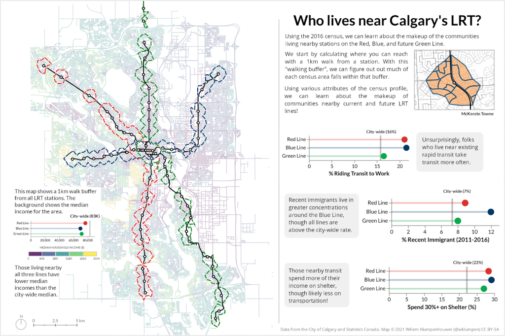
The choice of what demographic categories are summarized is a judgement call and can easily be adjusted for specific contexts, but my goal was to showcase three relatively distinct census categories: Mode share captures current transit use in the narrow context of travelling to work, and comparing the existing lines with the yet unbuilt one shows the potential for future change. Recent immigrants may rely more on transit to access opportunities and engage with their new home, and individuals who are shelter-burdened within the city are less likely to have disposable income for more expensive forms of transportation such as the private automobile.
There is also an effort here to follow Edward Tufte’s suggestion to minimize “chartjunk” and remove visual clutter to maximize information on the page. Bar charts become “lollipop” charts with a city baseline indicated using a small vertical line. The typical choropleth map showing median income has been overlaid onto the dense street network of the city to help the viewer orient themselves with familiar roads instead of with the shape of dissemination areas. This has the added effect of emphasizing that the reach of station areas depends on the available walking network.
The analysis uses entirely open data and open source software (qGIS and Python). A visualization like this could easily be reproduced and adapted for any Canadian city, infrastructure project, or sociodemographic insight. These visualizations can be placed into reports by city staff, sent to politicians by advocates, or included in news articles by journalists. With clearer insights we can help our decision makers maximize their understanding of an issue within their limited available time.
Disclaimer: the research described in this piece was not funded by or conducted as part of Mobilizing Justice. The views and opinions expressed here are those of the authors and do not necessarily reflect the views or positions of Mobilizing Justice.
You may also like
 Making it safe, Making it work, and Making it fun: strategies for cycling with young children in Hamilton, Canada
Getting around by bike with young children is not always easy. Children are heavy, family schedules can be busy, and children often need to be… Read More
 What can we learn from a Bike Bus program in rural Nova Scotia?
There’s a revolution happening in the rural community of Hebbville, Nova Scotia (Mi’kma’ki) and it’s accompanied by a healthy dose of bike joy. Since 2020,… Read More
 Removing Fare Barriers: Free Public Transit for Youth Experiencing Homelessness in Toronto
Noah Kelly is the Director of Research & Partnerships at the Transit Access Project (TAP) and has recently completed his Master of Arts at McGill… Read More